Some links in this post are affiliate links. If you buy something through one, Life in Soft Colors earns a small commission and you pay exactly the same price. (It does not change what I recommend.) More on how that works.
For a long time I used beige, greige, and taupe interchangeably. All three just meant “neutral brownish color, not white, not gray” in my head, and I did not think there was much more to it than that. Then I tried to match a rug to a couch using only those words and learned, the hard way, that they are not the same thing at all.
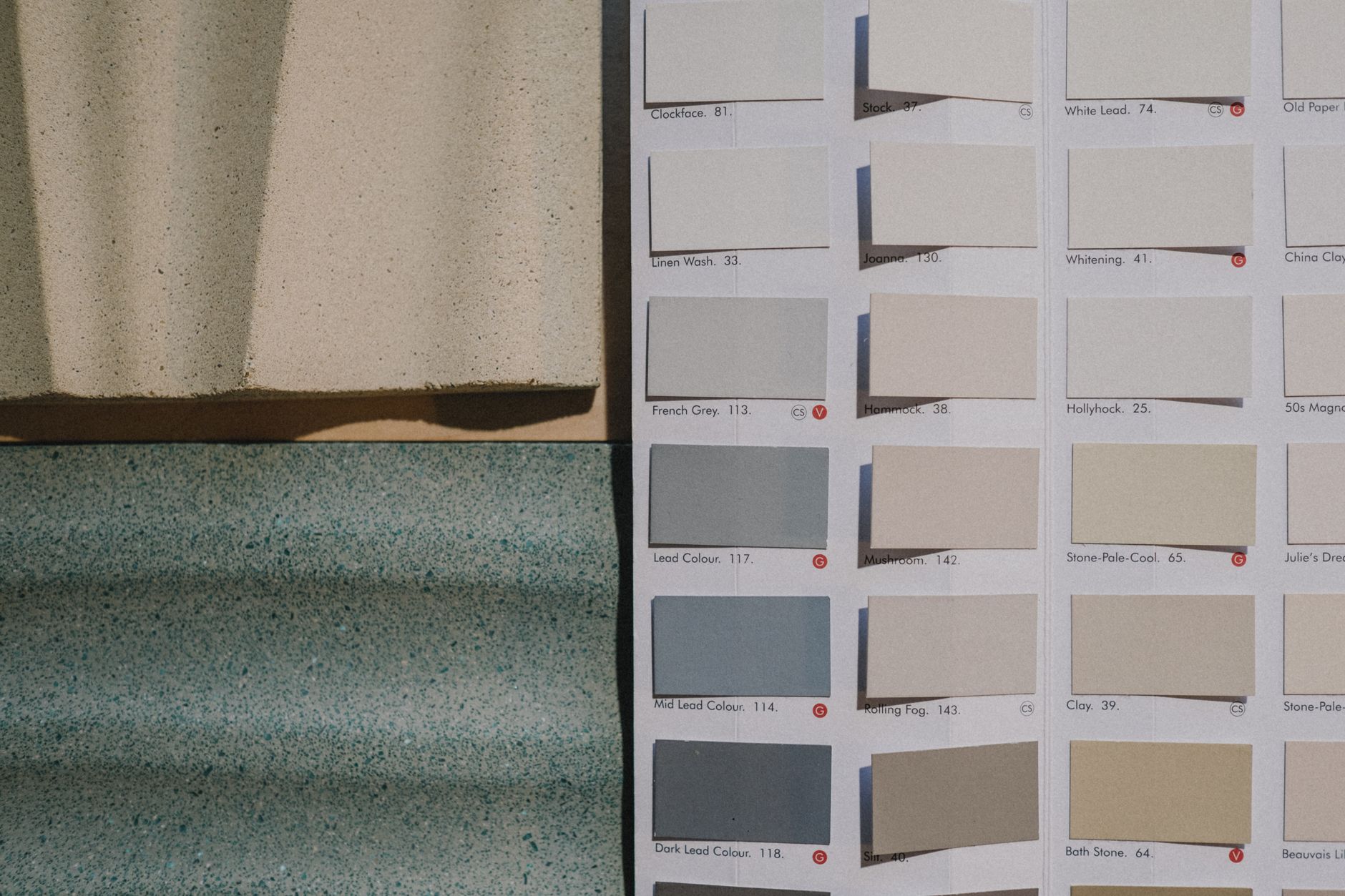
So here is my attempt to actually pin these down, based on staring at a lot of paint chips and fabric swatches, not any official color theory course (I have no such credentials, just a lot of opinions and a returns folder full of throw pillows).
Beige, the original
Beige is the one everyone knows and, honestly, the one everyone loves to dunk on. To me, true beige leans warm and a little yellow. Think of raw canvas, or the inside of an oatmeal cookie before it is baked. It has almost no gray in it at all.
Beige gets a bad reputation because it is so often used flat and alone, with nothing to contrast against it. A beige wall, beige couch, and beige carpet in the same room is where the “boring” reputation comes from. But beige on its own, next to something with real contrast like a dark wood floor or a deep green plant, can look genuinely warm and inviting instead of sleepy.
Where beige works best
- Rooms that get a lot of natural light already, where warmth helps rather than adds to a dim feeling
- Paired with black or dark brown accents for contrast
- Fabrics with visible texture, like a woven basket or a nubby throw, so the warmth reads as cozy instead of flat
Greige, the compromise everyone reaches for
Greige is exactly what it sounds like, gray and beige mixed together, and it became the default neutral for a reason. It splits the difference: warm enough to not feel cold and sterile, cool enough to not feel dated or heavy.
The tricky part with greige is that it is a moving target. Some greiges lean much closer to gray, others lean much closer to beige, and the difference between two paints both labeled “greige” can be surprisingly big in person. I have learned to always test a greige paint on the actual wall, not just look at the chip, because the same can labeled greige has looked almost purple in one room and almost tan in another for me.
If beige is a cookie and gray is a stone, greige is somewhere in between, and exactly where in between depends entirely on the light in your room.
Where greige works best
Greige is the safest all-purpose choice if you are not sure yet what direction you want a room to go. It plays reasonably well with both warm wood tones and cooler metals like brushed nickel, which is part of why it became so popular. The tradeoff is that because it splits the difference, it can also feel a little noncommittal if the rest of the room does not have a clear point of view either.
Taupe, the moodier cousin
Taupe is where things get more interesting to me. It is deeper and often has a slight purple or mauve undercurrent that beige and greige do not have. It reads as more sophisticated, in my opinion, but it can also tip into looking a little dull or heavy if the room does not have enough light or enough contrast to support it.
I think of taupe as the neutral with the most personality, even though it is still technically a neutral. A taupe wall in a dim room can feel a little flat and gray. That same taupe wall with good light and a warm lamp glow at night can feel rich and almost velvety.
Where taupe works best
- Rooms with good natural light or warm artificial light in the evening
- Bedrooms and other spaces where you want cozy over crisp
- Paired with dusty pinks or soft greens, which pick up on that faint purple undertone nicely
How I actually tell them apart now
My rough and completely unscientific test: I look at a swatch next to a plain white sheet of paper. If it reads clearly yellow or tan against the white, it is probably beige. If it reads mostly neutral with just a hint of warmth or coolness, it is probably greige. If it reads a little purple, plum, or grayish-brown and slightly heavier than the other two, it is probably taupe.
None of this is official. Paint companies name things differently, and I have seen “greige” used for colors I would call straight up taupe. But having even a rough mental sorting system has made shopping so much less frustrating, because now when something looks wrong in a room, I can usually tell you which direction it is wrong in, warmer or cooler, lighter or heavier, instead of just going “hmm, no.”
Mixing the three in one space
You do not have to pick just one. Some of my favorite neutral rooms actually use all three, a taupe accent chair, a greige wall, and a beige linen curtain. The trick is letting one of them lead. If you try to give beige, greige, and taupe equal weight in the same room, it tends to look accidental rather than layered. Pick the one that matches the mood you actually want (cozy leans taupe, crisp leans greige, warm and casual leans beige) and let the other two support it in smaller doses.