Some links in this post are affiliate links. If you buy something through one, Life in Soft Colors earns a small commission and you pay exactly the same price. (It does not change what I recommend.) More on how that works.
I used to think neutral just meant safe. Pick a beige, any beige, and you are done, right? Then I spent an embarrassing number of weekends standing in paint aisles holding swatches up to a window, and I started noticing something: some neutrals look like a decision. Others look like the absence of one.
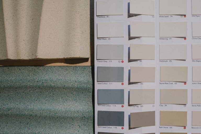
It took me a while to figure out why, because on paper the colors are so close. Two shades of oatmeal that look nearly identical on a paint chip can read completely differently on a wall. So here is what I have landed on after way too much time thinking about this (my partner thinks it is a little unhinged, honestly).
It is rarely about the color itself
The first thing I got wrong was assuming the specific hue mattered most. It does not, not really. A warm gray and a cool gray can both look great or both look flat depending on what is around them. What actually separates the good ones from the sad ones is usually one of three things: undertone clarity, the material it is sitting on, and how much contrast is nearby.
Undertone clarity
Cheap-looking neutrals are usually muddy. Not muddy as in dirty, muddy as in undecided. The paint or fabric cannot commit to being warm or cool, so it sits in this in-between zone that your eye reads as flat instead of soft. Expensive-looking neutrals, on the other hand, usually pick a lane. A greige that leans clearly warm, or a gray that leans clearly cool, reads as intentional even if the difference from its muddier cousin is tiny.
I noticed this most with a secondhand couch I almost bought. In the store it looked like a nice oatmeal color. Got it home and in my living room light it looked… nothing. Not warm, not cool, just sort of tired. I think the fabric dye just did not have a clear direction, and once I knew to look for that I started seeing it everywhere.
The material carries more weight than the color
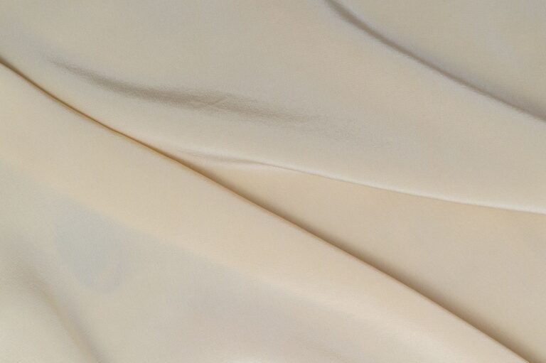
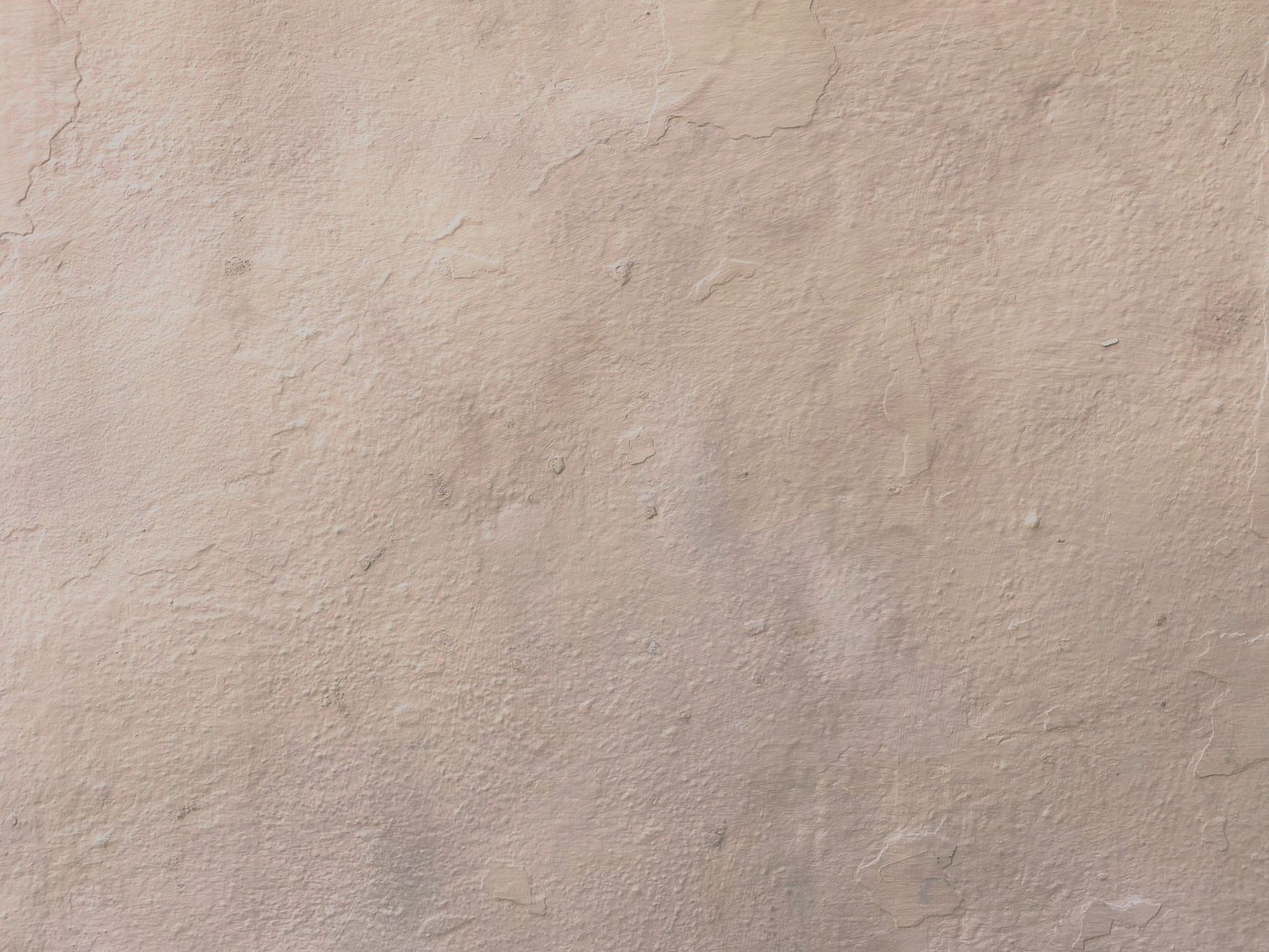
This one surprised me. The exact same off-white looks completely different on a smooth painted wall versus a linen curtain versus a laminate cabinet. Texture is doing so much of the work that I think we give color too much credit. A slightly imperfect, nubby texture in a neutral tone almost always reads as more considered than a flat, glossy version of the same shade.
The cheapest looking neutral I own is a perfectly smooth, perfectly beige plastic storage bin. The most expensive looking neutral I own is a slightly nubby, unevenly dyed linen pillow cover in almost the exact same shade.
Same color family. Wildly different feeling. That gap is texture, not hue.
Contrast is doing more than you think
Here is the other thing nobody tells you: a neutral almost never lives alone. It sits next to trim, next to flooring, next to whatever else is in the room. And the contrast between your neutral and its neighbors changes how the neutral itself reads.
A soft gray wall against bright white trim looks crisp and a little formal. The same gray wall against warm wood trim looks cozy and grounded. The same gray again, against another slightly different gray, can look like nothing happened at all, which is usually the flat, cheap-feeling result people are trying to avoid without knowing why.
- Low contrast between neutrals in the same space tends to read as underdone, not calm
- A little bit of tonal difference (even subtle) tends to read as layered
- Matching everything exactly is almost never the goal, even when it looks that way in photos
The trap of matching too perfectly
I think this is the biggest mistake I made early on. I wanted my neutrals to match. Same warmth, same depth, everything coordinated like a paint store display. It looked, and I say this with love for past me, kind of like a hotel lobby from 2011.
What actually reads as intentional is neutrals that are close but not identical. A stone colored throw on a slightly cooler gray couch. A cream lampshade next to a warmer cream wall. The tiny mismatch is what tells your eye that a person chose these things rather than that they all came from the same three-piece bundle.
How I check now
My unscientific test these days is to squint at a room (yes, actually squint) and see if anything disappears into anything else. If two neutral surfaces blur into one shape when I squint, I know they are too close in both tone and value, and the space is going to feel flat rather than soft. If I can still make out distinct shapes, even faint ones, the layering is doing its job.
I also try to notice the room at a different time of day before committing to anything. A neutral that looks rich and warm at 10am can look gray and sad at 7pm under a warm bulb, or the other way around. This is not me being precious about it, it genuinely changes how a color reads, and I have repainted a hallway once because I only ever looked at the swatch in daylight.
What “looks expensive” actually means
I want to be honest that I do not think this is really about money. Plenty of genuinely expensive neutral fabrics look flat and lifeless, and plenty of thrifted or budget pieces look rich because the undertone is clear and the texture has some life to it. What we are calling “expensive looking” is really just “looks like someone paid attention,” and that attention is available at every price point.
So if you are staring at two nearly identical beiges trying to figure out which one to pick, my honest advice is to stop comparing the colors in isolation. Look at what is texture, what undertone it leans toward, and what it is going to sit next to. That is where the actual difference lives, not in the little paint chip itself.