Some links in this post are affiliate links. If you buy something through one, Life in Soft Colors earns a small commission and you pay exactly the same price. (It does not change what I recommend.) More on how that works.
For the longest time, when people talked about a neutral being warm or cool, I genuinely could not see it. A gray was a gray to me. Someone would point at two paint chips and say one was clearly cooler, and I would just nod along, privately thinking they were making it up. I promise this is a thing you can actually learn to see, because I did, eventually, and it changed how I shop for basically everything in my home.
What warm and cool actually mean here
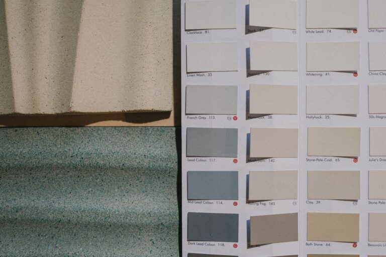
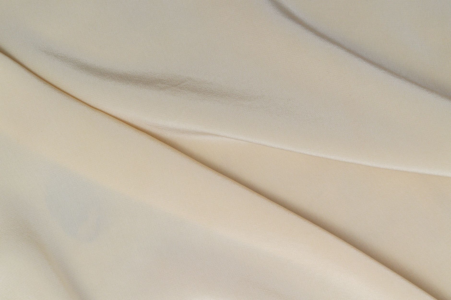
Every neutral color, even the most neutral seeming gray or beige, has an undertone, a very faint hint of another color hiding underneath the main one. Warm undertones lean toward yellow, orange, or red. Cool undertones lean toward blue, green, or purple. The undertone is usually subtle enough that you would not notice it looking at the color by itself. You notice it by comparison, when you put two similar neutrals side by side.
This is the part that finally made it click for me: stop looking at one swatch alone. Put two next to each other, even two that look almost identical apart, and the undertone jumps out. One will suddenly look pink-ish or yellow-ish, and the other will look blue-ish or green-ish, in a way that was invisible when I only looked at them one at a time.
The paper towel test
My genuinely favorite trick, and I did not invent this, someone told me about it years ago: hold a neutral swatch next to a plain white paper towel or sheet of printer paper. The pure white gives your eye a true baseline, and against that baseline, warm undertones will look slightly yellow or peach, and cool undertones will look slightly blue or lavender. It sounds too simple to work, but it genuinely does.
Where this actually matters in a room
Once I could actually see undertones, a bunch of things that used to confuse me suddenly made sense. Like why a gray couch I loved in the store looked slightly off once I got it home. My walls had a warm undertone and the couch had a cool one, and next to each other, that clash was quietly making the whole room feel a little unsettled, even though I could not have told you why at the time.
- Warm neutrals tend to feel cozier and more grounded, they play well with wood tones, brass, and soft golden lighting
- Cool neutrals tend to feel crisper and calmer, they play well with metals like chrome or brushed nickel, and daylight-toned lighting
- Mixing the two without noticing is usually what causes that vague “something is off” feeling in a room
Metals give it away fast
If you are still not sure whether something reads warm or cool, look at what metal finish is nearby. Brass, gold, and bronze tend to sit better with warm neutrals. Chrome, nickel, and stainless steel tend to sit better with cool neutrals. This is not an absolute law, mixed metal rooms exist and can look great, but it is a fast way to check your instinct if you are not sure which direction a neutral is actually leaning.
Mixing warm and cool on purpose
Here is the part I actually find more interesting than just matching everything correctly: once you can see undertones clearly, you can mix warm and cool neutrals on purpose, and it can look really good, not like a mistake.
The key difference between an accidental clash and an intentional mix, in my experience, is contrast and confidence. A muddy in-between attempt, where you are not sure if something is warm or cool and you just hope it works out, tends to look off. A deliberate pairing, where you pick a clearly warm piece and a clearly cool piece and let them sit next to each other on purpose, tends to look intentional and even a little sophisticated.
My favorite corner of my apartment right now is a warm oatmeal linen chair against a cool dove gray wall. Neither one is trying to match the other, and that is exactly why it works.
A few pairings that have worked for me
- A cool gray wall with warm wood furniture and warm-toned textiles, the wood adds the warmth the wall is missing
- A warm cream wall with cool gray upholstery, the upholstery keeps the room from feeling too syrupy
- Cool stone tile with warm wood cabinetry in a kitchen, which is honestly one of the most common combinations you will see because it works so reliably
What I still get wrong sometimes
Even now, I occasionally buy something online where the photo made a neutral look cooler or warmer than it actually is in person, screen lighting is its own whole mess. My rule now is to never fully trust a product photo for a neutral colored item and to always check return policies before ordering anything meant to match existing decor. Undertones are subtle enough that even good photography sometimes cannot capture them accurately.
I also used to assume that once I learned to see undertones, I would want everything in my space to match perfectly, all warm or all cool. Honestly the opposite happened. Once I could see the difference clearly, mixing them on purpose became one of my favorite tools, not something to avoid. It just had to be a choice, not an accident.