Some links in this post are affiliate links. If you buy something through one, Life in Soft Colors earns a small commission and you pay exactly the same price. (It does not change what I recommend.) More on how that works.
I will admit something a little embarrassing: I used to think anyone who cared about the difference between one white paint and another was, gently, making it up. White is white. It is the absence of color. What is there to even discuss? And then I painted a hallway what I thought was a clean, simple white, and it came out looking faintly greenish under my kitchen lights, and I understood, immediately and completely, that I had been wrong.
White is basically never actually white
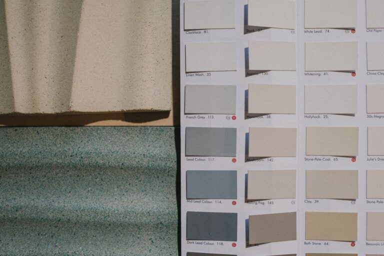
Almost every off-white you will encounter has a faint undertone hiding in it, the same way beige and gray do. Some lean warm, toward cream or ivory. Some lean cool, toward a faint blue or gray. Some, and these are the tricky ones, lean toward green or yellow in a way that only shows up under certain lighting, which is exactly what happened to my unfortunate hallway.
This is why two “whites” that look identical on a small paint chip can look completely different once they cover an entire wall. Color intensifies with area, a small chip barely shows an undertone, but a whole wall of it will make that same faint tint impossible to miss.
The ones I have actually learned to tell apart
I am not a paint expert and I am not going to pretend I can identify a hundred different whites on sight. But after enough trial and error, here are the categories I have actually trained my eye to notice.
- Warm white or ivory: leans slightly yellow, feels soft and a little vintage, can look almost cream in certain light
- Cream: a step further warm than ivory, closer to a very pale yellow than a true white, cozy but can look dated if paired with the wrong things
- Cool white: leans slightly blue or gray, feels crisp and clean, can look a little clinical without enough warmth elsewhere in the room
- True neutral white: genuinely hard to find, this is the one that manages to sit right in the middle with barely any undertone at all, and it tends to look slightly different depending on what is next to it, which is sort of the whole point of a neutral
Why the room around it matters so much
Here is the thing that finally made this click for me: the “correct” white does not really exist in isolation. It depends entirely on the room. North-facing rooms tend to get cooler, bluer light, so a warm white can help balance that out and keep the room from feeling cold. South-facing rooms already get warm, golden light, so a cooler white can help keep things from tipping into looking overly yellow or dated.
I learned this the annoying way, by painting the same “greige-adjacent white” in two different rooms of my apartment and getting two completely different results. In my north-facing bedroom it looked soft and warm, genuinely lovely. In my south-facing kitchen, with all that afternoon sun, the same paint looked almost yellow by 4pm. Same can, same color, wildly different feeling, because the light doing the work was so different.
Nobody warns you that the direction your windows face matters more for choosing a white than almost anything else about the paint itself.
My actual process now
I do not trust a paint chip anymore, full stop. I get a sample, paint a reasonably large swatch directly on the wall (not on a spare piece of cardboard, the wall itself), and look at it at three different times: morning light, midday, and evening with the lamps on. If I still like it in all three, it is probably safe. If I only like it in one, I know I am picking a color that is going to feel inconsistent depending on time of day, which gets old fast.
Off-white in fabric versus off-white in paint
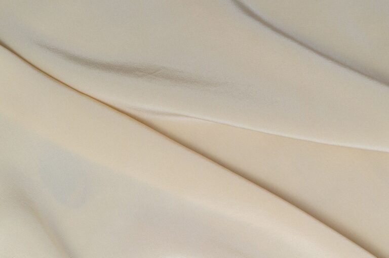
One thing that took me a while to realize is that off-white behaves differently depending on the material it is on. A linen curtain in warm white looks soft and a little rumpled in a good way, the texture of the linen itself adds warmth even before you consider the undertone. The exact same warm white in a smooth, glossy paint finish can look almost plasticky by comparison. Matte and textured surfaces tend to be more forgiving with off-whites generally, while shiny or very smooth surfaces make any undertone, warm or cool, much more obvious and sometimes harsher than intended.
A few pairings I keep coming back to
- Warm white walls with cool gray or charcoal accents, so the room does not tip too far into feeling syrupy
- Cool white trim against warm wood floors, letting the wood carry the warmth instead of the wall
- Cream textiles layered against a true neutral white wall, which lets the texture and slight warmth of the fabric stand out instead of disappearing
Why I stopped feeling silly about this
I think the reason white feels invisible until suddenly it does not is that we are trained to see it as a blank, a non-color, a background. But it takes up more visual space in most rooms than almost any other color choice you will make, walls, trim, ceilings, sometimes cabinets and furniture too. Once I started actually paying attention to which whites felt warm and inviting versus which ones felt a little cold and sterile, I stopped thinking of it as a fussy or unnecessary thing to care about. It turned out to be one of the most useful things I have learned about decorating a space, full stop, not just a neutral color footnote.