Some links in this post are affiliate links. If you buy something through one, Life in Soft Colors earns a small commission and you pay exactly the same price. (It does not change what I recommend.) More on how that works.
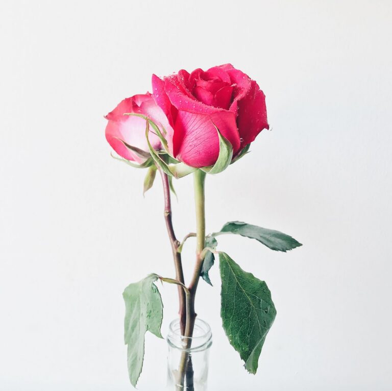
I set a table for four people last spring and, out of habit, reached for a set of patterned napkins I had bought years ago in a moment of ambition. Blue and white, fairly busy, matched to nothing else on the table. I got them halfway folded before I stopped and put them back in the drawer. My table already had a lot going on that day (real food, real glasses, a slightly mismatched set of plates from two different sets I own), and the last thing it needed was a loud napkin pattern competing with all of it. Instead I grabbed a stack of plain cream napkins and set a single small vase with one stem of dark pink ranunculus in the center. That was it. That was the whole color plan.
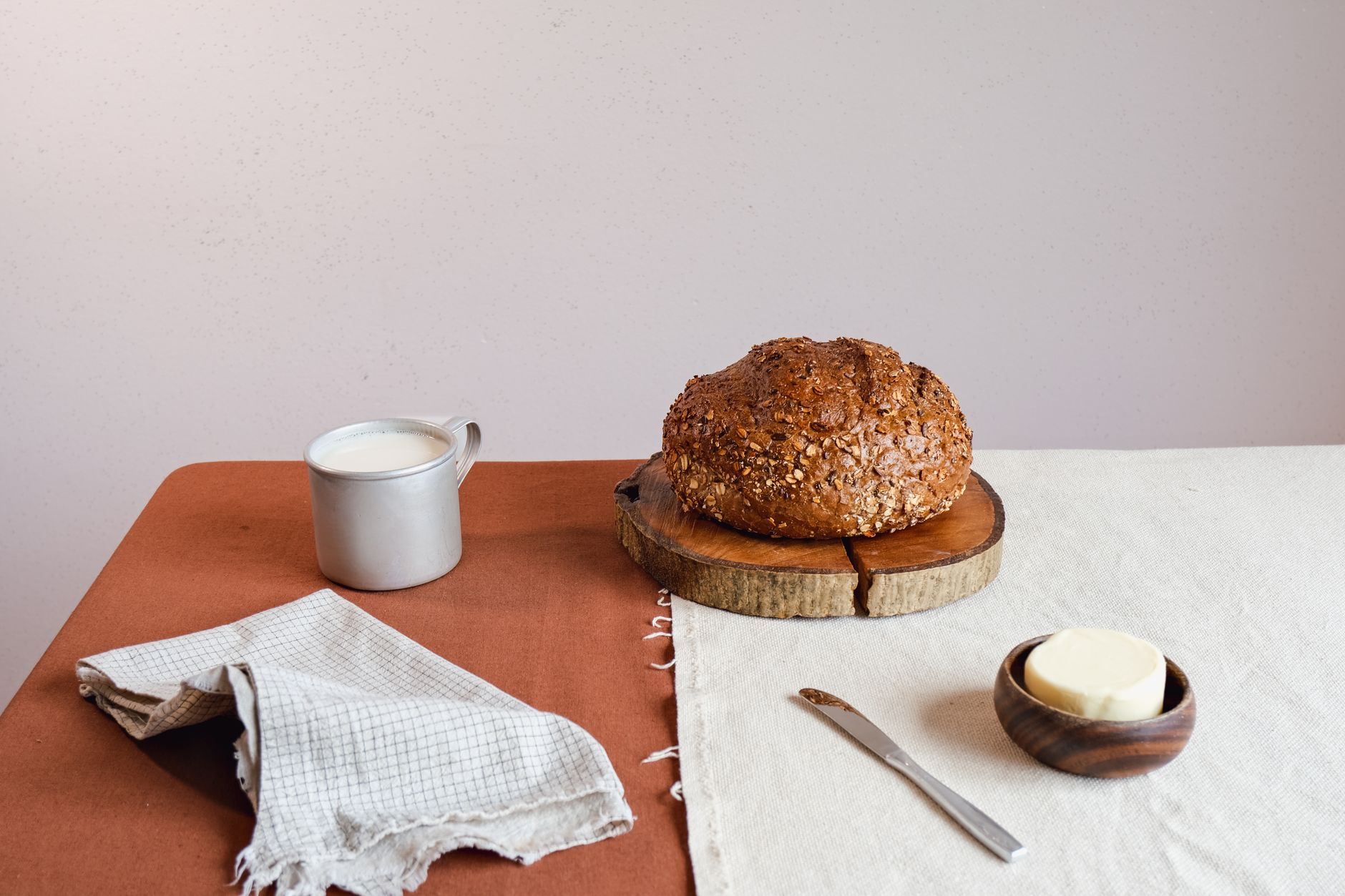
A neutral table, meaning mostly white, cream, wood-toned dishes and linens, is one of the best places to practice small-dose color because the stakes are so contained. You set it, you use it for a meal, and then it is put away. If it does not work, nothing is permanently wrong with your dining room.
Why the table is different from the rest of the room
Most of the color decisions in a home are semi-permanent. A pillow lives on your couch for months. A mug lives in rotation for years. A table setting exists for the length of a meal, which means you can experiment far more freely here than almost anywhere else in the house. This is actually a good place to test whether you like a color before committing to it somewhere more lasting, like a piece of furniture.
I have used the table this way more than once. Before I bought that clay pillow I wrote about, I actually tested clay as a color first with a set of cloth napkins for a dinner. Seeing it against my plates and glasses for a couple of hours told me more about whether I liked it than staring at a paint chip ever could.
Where the color should live on the table
Just like the pillow on the couch, the trick here is picking one place for color to live and letting everything else stay quiet. A few options that tend to work well.
- A small centerpiece, whether that is a single stem in a jar, a small bowl of citrus, or a handful of seasonal fruit, gives you one clear focal point without touching the plates or napkins at all.
- Napkins in a single solid color, no pattern, tend to work better than a printed set, since a print introduces multiple colors at once and starts competing with itself.
- One accent plate per place setting, tucked under a plain white one, can peek out at the edges without taking over the whole setting.
I would avoid trying to do more than one of these at once when you are first getting a feel for it. Color on the napkins and color in the centerpiece and color on an accent plate is a lot for one table, even if each piece on its own would have looked good.
Matching the season without overthinking it
One thing I have noticed is that the table is a natural place to let color shift with the seasons, more than almost any other spot in the house. A deep red or burnt orange runner in the fall, then plain cream again the rest of the year. A single stem of something bright in early summer. You are not committing to a color scheme for the room, just for an afternoon, so there is room to follow whatever feels right for that specific week.
A table only needs to hold color for the length of a meal. That is exactly why it is such a good place to experiment.
What tends to go wrong
The main mistake I see, and the one I almost made with those blue napkins, is bringing in a full pattern instead of a single solid color. A patterned napkin, a patterned tablecloth, even a patterned plate, all introduce more than one color at once, and on a table that is otherwise neutral, that pattern becomes the whole story instead of a quiet accent. If you love a pattern, that is a fine choice, but it is a different choice than the small-dose approach this post is about. Know which one you are going for before the table is already set.
The other thing that trips people up is using too many small colorful objects instead of one. A colorful napkin plus a colorful centerpiece plus colorful glassware might each be lovely on their own, but stacked together on one table they stop reading as an accent and start reading as a full color scheme, which asks something different of the room and the food on it.
A simple way to start
If you want to try this at your next meal, my honest suggestion is the smallest version possible. One plain-colored napkin per place setting, in a shade that feels warm against your existing dishes, and nothing else added. See how it feels. Add a small centerpiece the next time if you want more. You will learn quickly how much color your particular table actually wants, and it is almost always less than you would guess sitting in a store staring at napkin options.