Some links in this post are affiliate links. If you buy something through one, Life in Soft Colors earns a small commission and you pay exactly the same price. (It does not change what I recommend.) More on how that works.
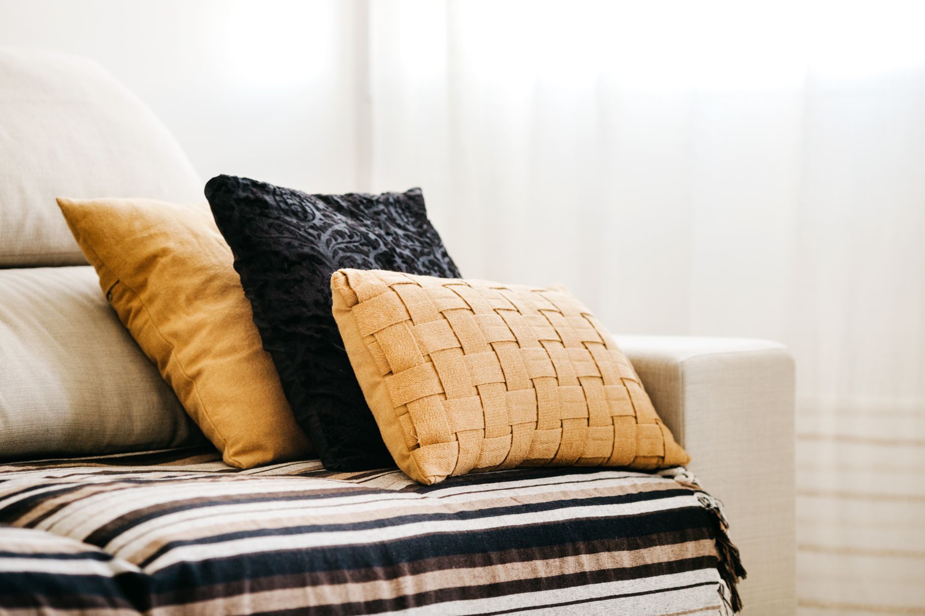
I used to think adding color to a room meant committing. A new rug. A painted wall. Some big decision I would have to live with for years and probably regret by spring. Then I bought one clay-colored pillow for a couch that was otherwise entirely oatmeal and cream, and it changed how the whole room felt without changing anything else about it. That is the trick of small-dose color. One object can do the work of a much bigger renovation, as long as it is the right object in the right spot.
The couch pillow is the easiest place to start because it is low commitment and high visibility. You see it every time you walk into the room. It is at eye level when you sit down. And unlike a wall, you can move it, wash it, or swap it out in ten minutes if it turns out you hate it. Low risk, high reward. That is basically the whole pitch for small-dose color.
Why one pillow works better than three
Here is something I learned the slow way: if you put three colorful pillows on a neutral couch, your eye does not know where to look first, so it ends up looking at nothing in particular. But one pillow, especially if it is a color that does not show up anywhere else in the room, becomes a focal point almost by accident. It is the thing your eye catches on its way across the space.
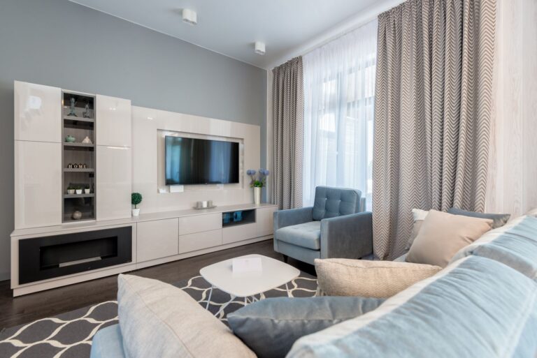
This is not about rules for their own sake. It is about what your eye actually does in a room. A neutral room (all that soft gray, all that warm white) reads as calm because there is nothing competing for attention. The second you add color, you are creating a hierarchy. One pillow says look here. Three pillows in different colors say look everywhere, which is really just another way of saying look nowhere in particular.
If you already have a couple of neutral pillows in linen or a nubby weave, keep those. Add one more in color and let it be the loud one. It reads as intentional instead of like you could not decide.
Picking the color without overthinking it
I am not going to tell you there is a scientific formula for this, because there is not, at least not one I trust. What I can tell you is what has worked in my own apartment and in a few friends’ places I have helped rearrange (mostly by moving their own stuff around, which is its own kind of magic).
- Look at what is already warm or cool in the room and lean the same direction. A room with a lot of honey-toned wood wants a warm pillow color (rust, terracotta, a soft gold) more than it wants something icy like a pale blue.
- Pull the color from something small that is already there. A worn leather chair, a wood bowl, even the color of the light coming through your curtains in the late afternoon. Small-dose color works best when it feels like it grew out of the room instead of landing in it from nowhere.
- Skip anything close to a primary color unless your whole room is built to handle it. A true red or a true blue pillow on a soft neutral couch can look like a mistake rather than a choice. Muted, dusty, slightly grayed-down versions of those same colors tend to sit better.
I went with clay because my apartment already had a lot of warm wood and cream linen, and clay felt like it belonged to that family without matching anything exactly. That is usually what I am after: related, not matched.
It does not have to be a pillow
The pillow is just the easiest example because almost everyone has a couch. But the same logic applies to a single vase, one ceramic bowl on a shelf, a throw blanket folded at the end of a bed, or a single piece of art in a mostly neutral hallway. The common thread is scale. Small object, real color, surrounded by enough quiet space that it gets to be the thing you notice.
I have a friend who did this with a single mustard-yellow mug that lives on open kitchen shelving next to a row of white ones. It is such a small thing, but every time I am in her kitchen my eye goes straight to it. That is the whole goal. Not a color scheme. A moment.
Where small-dose color goes wrong
The most common mistake I see (and have made myself) is choosing a color that matches something else in the room exactly. If your pillow is the exact same rust as your rug, it stops feeling like an accent and starts feeling like you were trying to coordinate a set. Coordinated can look nice, sure, but it is a different effect entirely, and it usually needs more than one piece to pull off well. A true accent should feel a little bit like it wandered in on its own.
The second mistake is choosing based on trend instead of on the room. I bought a sage green pillow a few years ago because it was everywhere, and it never once looked right against my warm-toned walls. It was not a bad color. It was just the wrong color for that specific room. Trends are a fine starting point for browsing, but the room you actually live in should be the one making the final call.
A good accent color should feel like it belongs to the room, not like it was dropped into it.
Living with it before you commit further
One thing I always tell people who ask me about this: live with the single object for a couple of weeks before you decide whether to add more color anywhere else. Move it around. Put it on a different chair. See it in morning light and evening light. Colors read differently depending on when you are looking at them (more on that in another post), and a pillow that looks perfect at 9am might look completely different by the time the sun goes down.
If after a few weeks you are still drawn to it, still noticing it, still glad it is there, that is usually a sign the color is right for your space, not just right in the abstract. And if it starts to feel like too much or oddly out of place, that is useful information too. Either way, you have only spent the effort of buying one pillow, not repainting a room. That is the whole point of starting small. You get to find out what works before you have committed to anything you cannot easily undo.