Some links in this post are affiliate links. If you buy something through one, Life in Soft Colors earns a small commission and you pay exactly the same price. (It does not change what I recommend.) More on how that works.
For a long time my vase situation was one clear glass cylinder, used for everything, no thought involved. It seemed like the neutral choice, the option that couldn’t clash with anything, because glass just shows the water and the stems and gets out of the way. Which is true! But it also means the vase is doing nothing, and I’ve started to think that’s a missed chance.
Clear glass is not actually neutral, it’s just quiet
Here’s the thing about clear glass, it shows the stems, and stems are green, and green is a color. So “clear vase” doesn’t mean “no color decision,” it means “green stems as the background color, plus whatever murk shows up in the water after day three” (nobody wants to talk about that part, but it’s true, and it’s part of why I started reaching for other vases for anything I actually cared about displaying for more than two days).
Clear glass works best, in my experience, with flowers that have interesting stems worth seeing, tulips especially, since they keep bending and curving in the water in a way that’s honestly more compelling than the blooms some days. For anything else, I think clear glass is a default people reach for out of habit, not because it’s actually the best-looking choice.
Matching a vase to a flower color, the easy version
The simplest move, and the one I’d tell anyone starting out, is picking a vase in a shade that already lives in the bouquet somewhere. Not the main color, one of the supporting ones. A bouquet with pink ranunculus and a little sage green filler looks properly put-together in a sage green vase, because the vase reads like it was chosen for that arrangement specifically, instead of grabbed off a shelf.
This works because it’s low risk. You’re not introducing a new color to the room, you’re just pulling one that’s already present and giving it a second, larger surface to sit on. The eye reads it as intentional even when the actual thought process took about four seconds.
Contrast is where it gets more interesting (and more nerve-wracking)
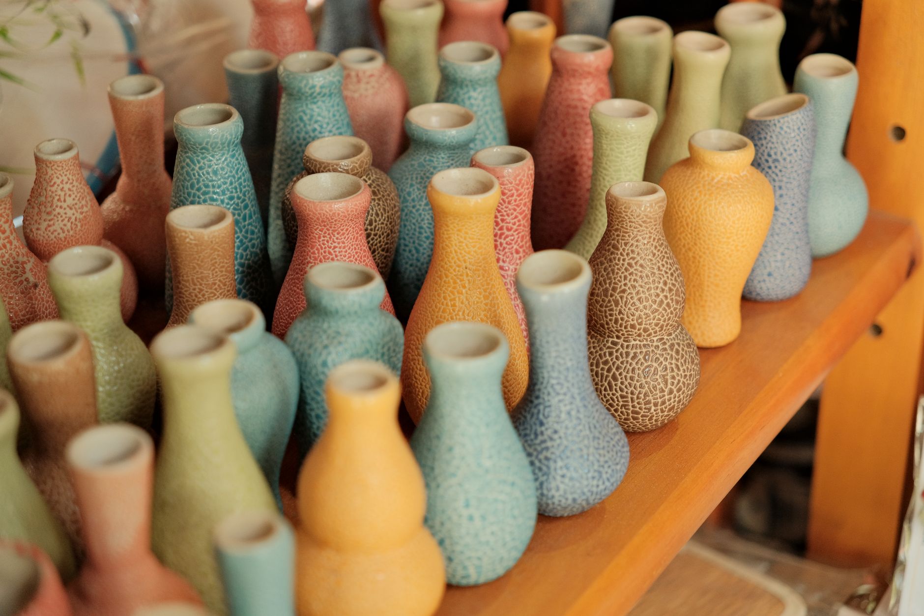
The move I’ve gotten more into lately is going the other direction, picking a vase color that’s nowhere in the bouquet at all. A terracotta vase under white and cream flowers. A deep blue-green vase under peachy roses. It’s a bigger swing and it doesn’t always land, but when it does it makes the whole thing look considered in a way that matching never quite achieves.
The trick, as far as I’ve figured out, is keeping one of the two elements muted. If the flowers are bold and saturated, the vase should be a quieter, more grounded color. If the vase is the bold one (a deep cobalt, say), the flowers should lean soft, whites and blush and sage, so there’s only one loud voice in the room instead of two arguing with each other.
- Bold flowers, quiet vase: hot pink or orange blooms in a matte white, stone, or soft gray vase
- Bold vase, quiet flowers: a deep terracotta or navy vase with white, cream, or dusty pink flowers
- Two quiet things together: sage vase with blush flowers, or cream vase with lavender, which almost never fails and is where I’d point anyone nervous about getting it wrong
What the vase does after the flowers are gone
Something I didn’t think about until I’d bought a few too many vases (oops): the vase outlives the bouquet by a lot. The flowers are gone in a week or two, the vase sits on that shelf for years. So the color decision isn’t really “what goes with this week’s flowers,” it’s “what am I going to look at on an empty shelf most of the time, with flowers in it only occasionally.”
That reframing changed what I buy. I stopped picking vases that only worked with one very specific bouquet color and started picking ones that could go empty and still look like they belonged where they were sitting. A dusty blue-green vase, empty, on an open shelf, still reads as a nice object. A vase in a very particular coral that only worked with one specific batch of ranunculus does not.
The best vase I own is a color I’d have picked for a bowl or a mug too. That’s probably the test.
Height and shape change how much the color even shows
One more thing worth knowing: a tall, narrow vase in a bold color reads as much bolder than a short, wide one in the exact same glaze, just because more of the surface is visible above the flowers. If you’re testing out a color you’re not fully sure about, a shorter vase is the lower-commitment way to try it, since the flowers cover more of it and the color becomes an accent instead of a statement.
I think that’s the real skill in all this, not memorizing which colors “go together” but noticing how much of each color is actually going to be visible once the whole thing is assembled. A vase color you’d never choose for a full wall works fine as a two-inch rim peeking out under a full, blousy bunch of peonies. Same color, completely different amount of it, completely different feeling in the room.