Some links in this post are affiliate links. If you buy something through one, Life in Soft Colors earns a small commission and you pay exactly the same price. (It does not change what I recommend.) More on how that works.
I used to think mixing patterns was about bravery. Like you just had to commit and stop overthinking it. And sure, some of that is true. But after enough tries (and enough take-backs), I noticed the pattern combos that worked for me weren’t random at all. They followed a pretty simple logic that has nothing to do with courage and everything to do with scale and shape.
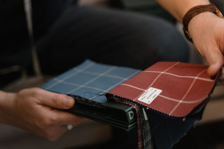
Here’s what I mean. A stripe and a floral can sit together beautifully. A stripe and a plaid usually cannot, at least not in the same room without one of them looking like it wandered in from a different house. It’s not about “loud versus quiet.” It’s about whether the patterns are speaking the same visual language or arguing over who gets to be the main character.
Start with the shape of the pattern, not the pattern itself
Every pattern has a underlying shape logic even if you never consciously notice it. Stripes are linear and directional. Florals are organic and irregular. Geometrics are usually angular and repetitive. Dots and checks are somewhere in between, more structured than a floral but softer than a hard geometric.
The combinations that feel effortless to me almost always pair an organic pattern with a structured one. A floral throw pillow on a striped chair. A leafy print curtain against a checked rug. The structured pattern gives your eye something steady to rest on, and the organic one keeps things from feeling too rigid. When I put two structured patterns together, like a stripe and a geometric with hard angles, it can work, but it takes more effort and usually needs a plain buffer between them (more on that in a second).
Two organic patterns together, like a floral and a paisley, is honestly the hardest combination to pull off. They both want attention in a soft, meandering way, and instead of complementing each other they just blur into visual noise. If you love that layered maximalist look, it can be done, but it’s not where I’d start if you’re testing the waters.
Scale does more work than color does
This was the thing that changed how I mix patterns for good. I used to think color was the tricky part. It’s not. Scale is. If you take two patterns in totally different colors but keep them at wildly different sizes, they’ll almost always get along. A big, loose floral and a tiny, tight stripe read as “layered” rather than “clashing,” even if the floral has six colors in it and the stripe has two.
The trouble starts when patterns are similar in scale. A medium floral and a medium geometric, both taking up roughly the same visual space, will compete instead of cooperate. Neither one gets to be the anchor, so your eye just bounces between them and never settles anywhere.
My rule of thumb (and it’s just mine, not some official design law): pick one pattern to be big and confident, and let the other one be small and almost like a texture from a few feet away. If I’m mixing three patterns, I try to make sure at least two of them are noticeably different in scale, even if the third one is closer in size to one of them.
Give them a plain patch to breathe in
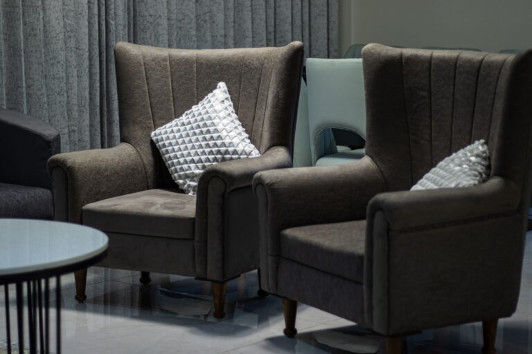
Even patterns that theoretically get along need somewhere for your eye to rest. This is the part people skip because it feels boring, but it’s what keeps a mixed-pattern room from feeling like it’s vibrating.
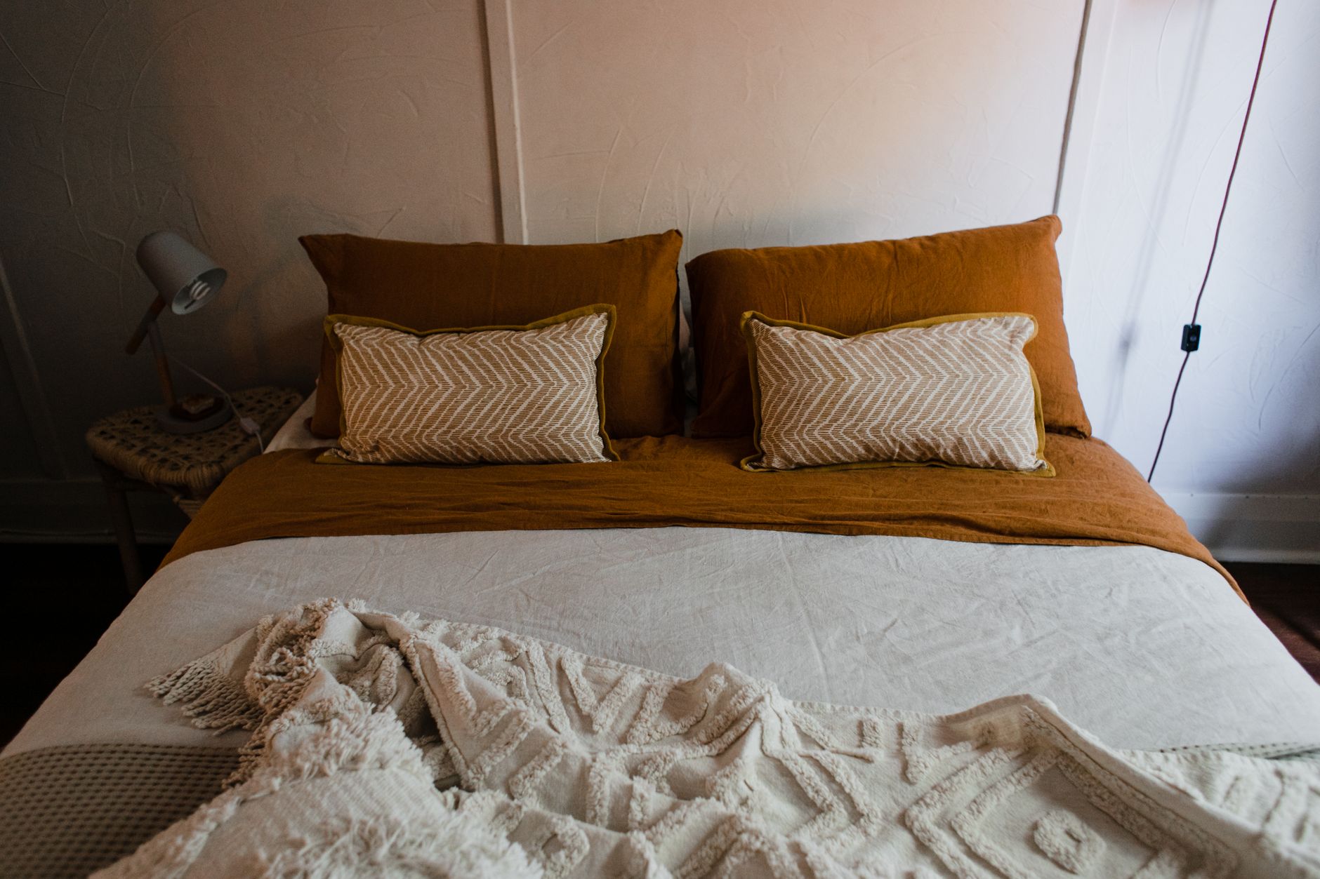
In practice this means a solid rug under a patterned sofa and patterned curtains, or a plain duvet under a patterned quilt and patterned shams. The solid piece doesn’t have to be neutral either, it just has to be quiet. A soft solid color in the same family as one of your patterns does more to hold a room together than another pattern ever could.
I think of solids as the pause between sentences. Without them, patterns just run together and nobody can tell where one thought ends and the next begins.
Repeating a color is the actual glue
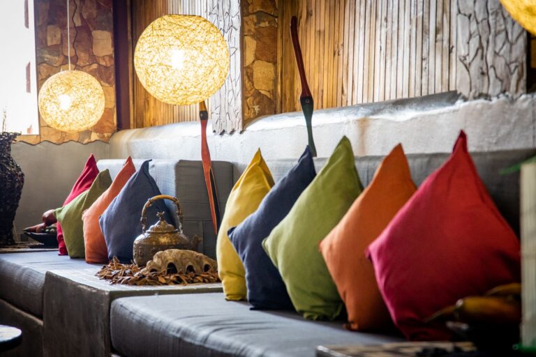
Once the scale and shape logic is sorted, color is what quietly ties the whole thing together, and it’s simpler than people expect. You don’t need matching patterns. You need one shared color that shows up in both of them, even if it’s a small accent in one and the dominant tone in the other.
Say your floral pillow has a dusty rose as a small accent flower among mostly sage and cream. If your striped chair has that same dusty rose as one of its two stripe colors, the two patterns will feel connected even though they look nothing alike otherwise. Your eye catches that repeated color and reads it as intentional, even if you weren’t being that precise when you picked the pieces.
This is also why patterns from the same “family” of tones tend to mix more easily than patterns chosen just because you liked them individually. If everything in the room leans toward the same warm, faded palette, the actual print (stripe, floral, dot, whatever) matters a lot less.
When to just stop at two
Three patterns in a small space can tip fast from layered to chaotic, especially if the room doesn’t have much plain wall or floor to counterbalance them. I’ve learned to ask myself if the room has enough “rest” built in already (a plain sofa, bare walls, simple flooring) before I add a third pattern into the mix. If the room already feels busy from furniture shapes or clutter, two patterns is usually the ceiling, not the floor.
And if you’re not sure whether a third pattern is helping or hurting, take a photo. It sounds silly but a phone camera flattens a room in a way that makes competing patterns much more obvious than standing in the room does. If two patterns seem to be arguing in the photo, they probably are.
None of this is a strict formula. It’s just the order I check things in now: shape first, scale second, a plain spot to land, then a shared color thread. Once those line up, the specific patterns matter a lot less than I used to think.