Some links in this post are affiliate links. If you buy something through one, Life in Soft Colors earns a small commission and you pay exactly the same price. (It does not change what I recommend.) More on how that works.
Somebody asked me once how many colors were “allowed” in a room, like there was a rulebook I was supposed to have memorized. I don’t think there’s a number. But I do think there’s a moment, and you know it when you hit it, where a mix of colors stops feeling put together and starts feeling like a junk drawer. The trick isn’t counting colors. It’s noticing when you cross that line.
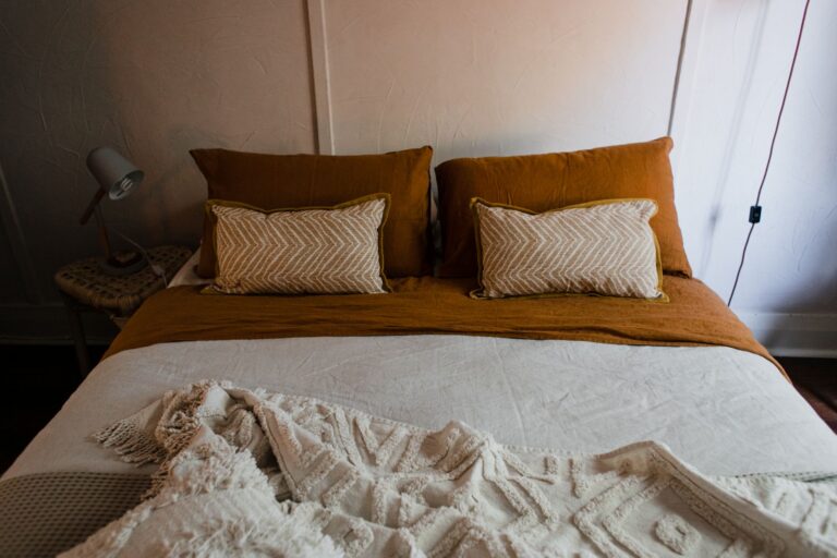
I’ve overdone it plenty of times. A bedroom that had a sage green wall, a mustard throw, a rust colored chair, and a blue and white patterned rug, all at once, all fighting for the same amount of attention. Nothing was wrong with any single piece. Together they were exhausting to be in.
Counting isn’t really the point
If you count colors literally, most rooms that feel calm actually have more going on than you’d guess. A neutral room might have five or six shades once you count the wood tones, the wall color, the fabric, and the little variations within “white.” So the number itself is a bit of a red herring. What matters more is how the colors are distributed and whether they’re taking turns or all shouting at once.
Give one color the lead role
Almost every mix that works has a color doing most of the talking, with the others playing supporting roles. That doesn’t mean the other colors have to be boring. It just means they show up in smaller amounts, or in less saturated versions, so your eye has somewhere to land first.
- Pick the color that covers the most surface area and let it set the mood
- Let a second color show up in a medium amount, maybe a third of what the lead color covers
- Treat any additional colors as accents, small enough that they read as punctuation, not paragraphs
- If you can’t tell which color is supposed to be the lead, that’s usually the actual problem, not the total count
Watch what happens when everything is equally loud
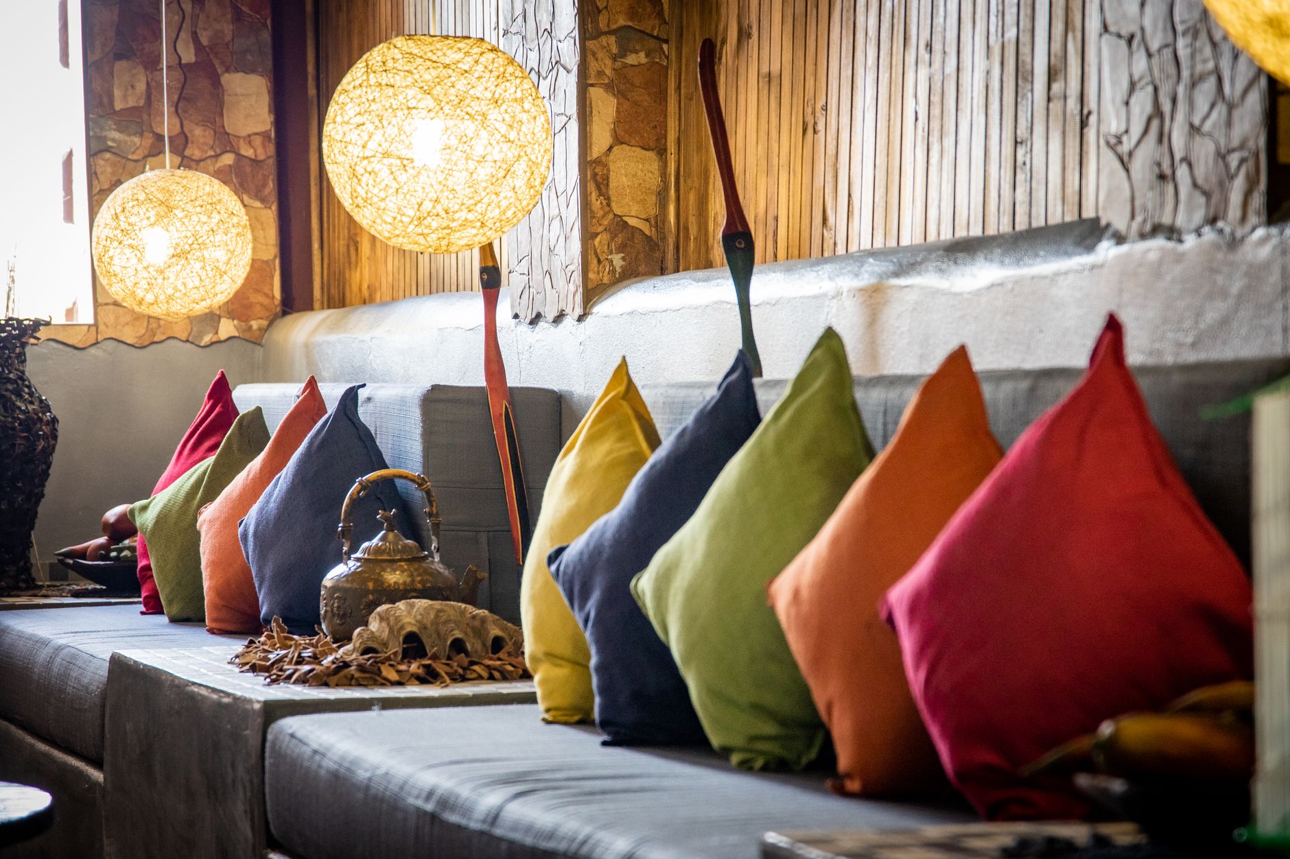
The outfits and rooms that feel chaotic to me almost always have colors that are all fighting at the same volume. A bright teal next to a bright coral next to a bright yellow, all with about the same amount of saturation and the same amount of space, is a lot to look at even if you love all three colors individually.
One easy fix is to let one of those colors turn down its own volume. Keep the teal bright but let the coral shift toward a dustier, softer version of itself, and suddenly there’s a hierarchy again. Your eye isn’t being asked to give equal attention to three loud things at once.
A mix doesn’t get busy because of how many colors are in it. It gets busy when none of them agree on how loud to be.
Use a neutral as a rest stop
When I’m nervous about a combination having too much going on, I add a neutral somewhere in the middle of it, almost like a rest stop for your eyes. A cream colored lampshade between a blue chair and a green rug. A tan belt breaking up a patterned top and patterned pants. It doesn’t erase the other colors, it just gives your eye a place to pause before it moves on to the next one.
This is honestly one of my favorite tricks because it lets you keep colors you genuinely love without asking you to give any of them up. You’re not editing the palette down, you’re just giving it some breathing room.
Patterns count as color, even when you don’t think of them that way
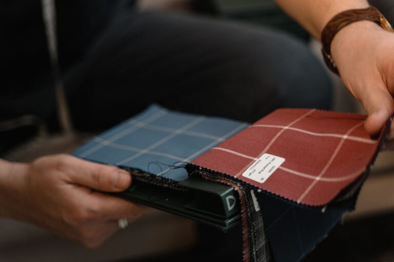
This one trips people up a lot, myself included for a long time. A patterned rug with five colors in it counts as five colors, even though it reads as “one rug” in your head. If you’ve got a patterned rug, a patterned curtain, and a solid but bright chair, you might be working with more colors total than you think you are.
When I’m mixing patterns, I try to treat the busiest pattern in the room as my whole color budget for that space, and keep everything else pulling from colors that already live inside that pattern. It sounds restrictive, but it actually makes decorating faster, because half your decisions are already made for you.
Step back and squint
This sounds silly but it works. Squint at the room or the outfit until the details blur out. What you’re left with is mostly blocks of color and roughly how much space each one takes up. If one of those blurry blocks feels like it’s competing too hard with another, that’s usually the pairing that’s causing the trouble, not the total number of colors in the room.
I do this with photos too. Taking a picture on your phone and looking at the thumbnail, small and blurry, tells you more about whether a combination works than staring at the real thing up close ever will. Distance is honest in a way that close inspection isn’t.
Trust the moment it starts to feel like too much
You will feel it before you can explain it. There’s a specific kind of restlessness that shows up when a room or an outfit has crossed from lively into overwhelming, and it’s worth trusting that feeling instead of arguing yourself out of it because you love every individual piece.
When I feel that restlessness now, I don’t start removing colors at random. I ask which one is trying hardest to be noticed, and I either turn its volume down or give it less real estate. Usually one small change is enough to bring the whole thing back into balance, and I get to keep almost everything I was worried about losing.