Some links in this post are affiliate links. If you buy something through one, Life in Soft Colors earns a small commission and you pay exactly the same price. (It does not change what I recommend.) More on how that works.
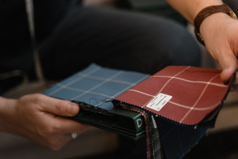
Patterns intimidate people in a way that solid colors don’t, and I get why. A striped pillow next to a floral chair next to a plaid throw feels like it’s asking a lot more of you than three solid colors would. But the truth is, mixing patterns is basically the same skill as mixing colors, with one extra thing to pay attention to. Once you see it that way, it stops feeling like a separate, scarier category.
I avoided patterns almost entirely for a long time because I was scared of getting it wrong. My rooms were all solids, safe and a little flat if I’m honest. The first time I mixed two patterns on purpose and it actually worked, I remember feeling almost suspicious of myself, like I’d gotten away with something.
Treat a pattern like it already has a color budget
Every pattern is made up of a handful of colors, whether it’s two colors or six. The easiest way to mix patterns is to pick one “lead” pattern and then only add colors, patterns included, that already show up somewhere inside it. If your floral has cream, a dusty rose, and a soft green, your striped throw pillow can pull from that same cream and dusty rose, and suddenly the two patterns look like they were always meant to be together, because in a sense they were, you just built it that way on purpose.
- Pick your busiest, most colorful pattern first and treat it as your color reference for everything else
- Pull two or three colors out of that pattern and use them as your shopping list for the rest of the room or outfit
- Let simpler patterns borrow from the busier one instead of introducing brand new colors of their own
- If a new pattern doesn’t share a color with your lead pattern, it will probably feel like it wandered in from somewhere else
Vary the scale, not just the print
This is the part that trips people up the most, myself included when I was starting out. Two patterns can share all the right colors and still feel off if they’re the same size. A medium sized floral next to a medium sized plaid, even in matching colors, tends to compete rather than cooperate, because your eye keeps trying to compare them at the same visual distance.
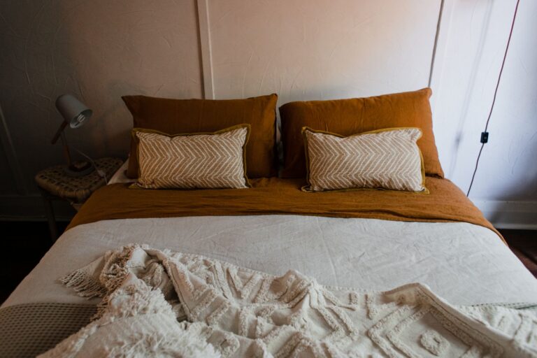
What actually works is contrast in scale. A big, loose floral pairs more easily with a small, tight stripe than it does with another medium sized pattern. One pattern gets to be the statement and the other gets to be the texture in the background, almost like a whisper next to something spoken at a normal volume.
Patterns don’t need to match. They need one of them to step back a little so the other one has room to be seen.
Let a solid do the resting
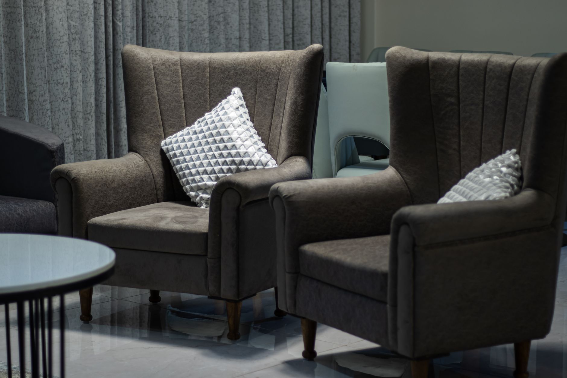
If two patterns feel like too much no matter how you arrange them, add a solid color pulled from both of them and let it take up more space than either pattern does. This works the same way a neutral does when you’re mixing solid colors, it’s a rest stop for your eyes, except now it’s resting from busyness instead of just from color.
I do this constantly with outfits. A patterned top and a patterned scarf can work together if the pants and shoes are a solid color pulled from both, giving your eye somewhere plain to land in between the two busier pieces. Without that solid anchor, the same combination can feel like it’s asking too much of you at once.
Check if the patterns have the same mood
Beyond color and scale, patterns carry a kind of personality. A loose, hand-drawn floral feels casual and a little imperfect. A crisp geometric stripe feels tidy and precise. These two moods can absolutely be mixed, but it works best when you do it on purpose rather than by accident, because when moods clash it reads as confusion rather than as an interesting contrast.
If I’m mixing something loose and organic with something crisp and structured, I usually make sure the colors are doing a lot of the connecting work, since the shapes themselves are already pulling in different directions. Shared color gives the mismatched moods a reason to be in the same room together.
Start smaller than you think you need to
If two patterns in a room already feels like a lot, you don’t need a third to make it interesting. A lot of the most successful pattern mixing I’ve done has actually been just two patterns plus a handful of solids, not a full patchwork of prints everywhere you look. The solids give the patterns room to breathe, and two well-matched patterns read as confident, while three or four unrelated ones start reading as cluttered.
When I’m nervous about a new pairing, I start with one small patterned piece, like a single pillow or a scarf, next to my main pattern, and live with it for a few days before adding anything else. It’s much easier to add a third pattern later than it is to walk one back once it’s already part of the room.
Give yourself permission to get it a little wrong
Some of my favorite pattern combinations happened because I put two things together I wasn’t fully sure about, lived with it for a week, and either loved it or quietly swapped one piece out. Nobody gets pattern mixing perfect on the first try by following a formula, including me, and the formula above is really just a way to make your guesses more educated, not a guarantee.
The patterns that actually make a room or an outfit feel alive are usually the ones that took a small risk. Solids are safe. Patterns ask a little more of you, and that’s exactly why they’re worth the extra thought when you get them right.