Some links in this post are affiliate links. If you buy something through one, Life in Soft Colors earns a small commission and you pay exactly the same price. (It does not change what I recommend.) More on how that works.
I went through a phase (still kind of in it, honestly) of wanting every room in my apartment to be entirely neutral. No bold colors, nothing loud, just cream and gray and stone and oatmeal everywhere. The first time I tried it, the living room looked like an insurance office waiting area. The second time, it looked genuinely warm and calm. Same basic color family both times. So what changed?
It took embarrassingly long to figure out, but I think I finally have it narrowed down to a handful of things that actually matter, and a bunch of things I used to worry about that turned out not to matter at all.
Sameness is the enemy, not color
The instinct with an all-neutral room is to make everything match. Same shade of beige on the walls, the couch, the curtains. It feels safe, like you cannot mess it up. But that sameness is exactly what makes a neutral room feel flat and a little sad, not the lack of bright colors.
Once I let the different neutrals in the room be slightly different from each other, warmer here, cooler there, lighter here, deeper there, the room stopped feeling like one big beige blob and started feeling like it had actual layers to it.
The rule of three depths
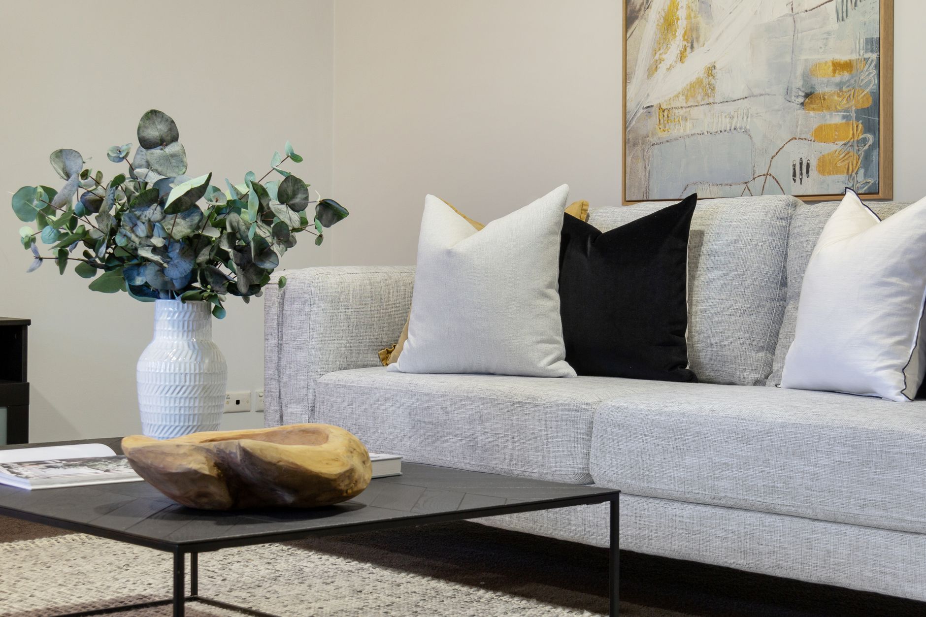
This is not an official design rule, just something I noticed working for me: aim for at least three different depths of neutral in a room. A light one (think cream or pale oatmeal), a mid one (like a warm gray or soft taupe), and a deeper one (like a rich charcoal-brown or dark walnut wood tone). When all three are present, your eye has somewhere to travel. When everything sits in the same light-to-mid range, the room reads as flat no matter how nice each individual piece is.
- Light: walls, large upholstery, curtains
- Mid: rugs, throw blankets, larger furniture pieces
- Deep: wood furniture, frames, a dark lamp base, even just a stack of books
Texture is doing half the work
I mentioned this idea before and I will keep coming back to it because it changed everything for me: in an all-neutral room, texture is basically doing the job that color usually does in a more colorful room. It is what keeps your eye interested.
A smooth linen curtain next to a chunky knit throw next to a smooth ceramic vase next to a rough woven basket, that mix of textures in the same tonal family is what makes a neutral room feel rich instead of empty. If everything in the room is smooth, or everything is nubby, it starts to feel monotonous even if the colors themselves are varied.
My living room did not start feeling finished until I stopped adding more neutral colored things and started adding more different textured things in colors I already had.
An easy texture checklist
When a neutral room feels flat to me, I run through this mental list of textures and see what is missing: something woven (basket, jute rug), something knit or nubby (throw, chunky pillow), something smooth and hard (ceramic, glass, polished wood), and something soft and matte (a linen or cotton textile with a flatter weave). Usually one or two of these are missing entirely, and adding even a single piece fills the gap.
Light changes everything, so test in real light
This one I learned by accident. I picked out what I thought was a lovely warm cream rug in a store with bright fluorescent lighting. Got it home, and under my warm lamp light in the evening it looked almost yellow, not the soft cream I thought I was getting.
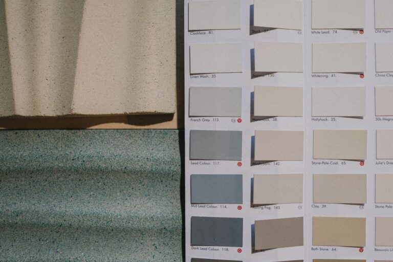
Neutral colors shift more than bold colors do depending on the light around them, because there is less pigment intensity to anchor how they read. So now I try to actually look at any neutral piece, paint chip, fabric swatch, whatever, in the room and lighting it is actually going to live in, not just under store lighting or daylight if the room gets mostly lamp light at night.
Give yourself one point of real contrast
The rooms of mine that worked best were not actually 100 percent neutral. They had one thing that broke the pattern a little, a black metal lamp, a dark framed print, even just a few books with dark spines on a light shelf. That single point of higher contrast gives your eye an anchor, a place to land, before it moves on to appreciate the softer layered neutrals around it.
Without that anchor point, an all-neutral room can start to feel like it is missing something, even if you cannot immediately say what. With it, the softness of everything else actually reads as a choice, calm on purpose, rather than a room that just forgot to add color.
Small ways to add that anchor
- A dark wood frame, even with a soft neutral photo inside
- A black or dark bronze light fixture or lamp base
- A stack of books with a darker spine visible
- Dark grout lines if you are tiling, which is a small detail but genuinely changes a whole kitchen or bathroom
What I would tell past me
If I could go back to my first attempt at that living room, I would tell myself to stop trying to make everything match and start trying to make everything relate. A slightly different depth here, a different texture there, one real anchor of contrast somewhere in the room. Neutral does not have to mean flat. It just means you have to work a little harder to create the interest that color would otherwise be doing for you automatically.