Some links in this post are affiliate links. If you buy something through one, Life in Soft Colors earns a small commission and you pay exactly the same price. (It does not change what I recommend.) More on how that works.
I can pick three colors that theoretically work together in about thirty seconds. Sage, rust, and cream, done. What actually takes me longer, and what I used to skip entirely, is figuring out how much of each one to use. And it turns out that’s the part that makes or breaks the whole thing.
I’ve had rooms where every color was “right” on paper and it still felt off, and I’ve had rooms with slightly clashing colors that somehow worked because the amounts were balanced. The colors matter less than I thought. The ratio matters more.
Somebody has to be in charge
The biggest mistake I made early on was treating my colors as equals. Three colors, roughly a third of the room each, felt fair and balanced in my head. In practice it just looked indecisive, like the room couldn’t commit to a mood.
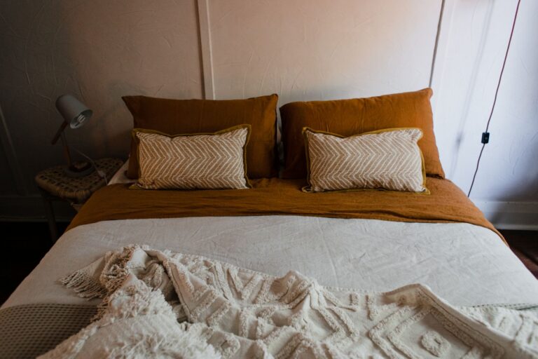
What works instead is picking one color to dominate, one to support, and one (sometimes two) to just show up occasionally. I think of it loosely as most of the room, a good chunk of the room, and then just a little. You don’t need exact numbers for this, but if you’re the type who likes something to hold onto, something like most, some, and a touch is close enough. The point isn’t precision, it’s that one color clearly wins.
Once I started doing this on purpose, the “which colors go together” question got so much easier, because it stopped being three equal decisions and became one big decision (the dominant color) and two much smaller, lower stakes ones.
The dominant color is quieter than you’d think
Here’s the part that surprised me. The color that should take up the most space in a room is almost never the one you’re most excited about. It’s usually the calmest, most neutral-leaning color in your palette, the one you could live with on a wall or a big sofa for years without getting tired of it.
The color you’re actually excited about, the one that made you want to build a palette around it in the first place, almost always works better as the support color or the accent. It gets to be more saturated, more unexpected, more “you” precisely because it’s not covering every surface. Give your favorite color less real estate, not more, and it tends to read as more special, not less.
I learned this the hard way with a terracotta I loved. I put it on a big rug thinking more terracotta equals more happy. Instead the room felt heavy and I stopped noticing the color at all after a week, it just became “the floor.” Moved it to a couple of accent pieces instead, cream took over as the dominant tone, and suddenly I actually saw the terracotta again every time I walked in.
Small doses of color hit harder than big ones
This is the part that took me the longest to actually believe, because it’s a little counterintuitive. A small amount of a bold or saturated color usually has more impact in a room than a large amount of the same color. One deep blue vase on a mostly neutral shelf catches your eye immediately. An entire wall of that same blue can actually recede once you’ve lived with it a while, because your eye adjusts to a big field of anything, even something bold.
So when I have a color I really love but I’m nervous about committing to, I don’t test it small because I’m being cautious. I test it small because small is often just the better call, full stop. A pillow, a stack of books, a single chair. If it earns its keep in that small dose (if I keep noticing it, keep liking it), then maybe it graduates to something bigger later. Most of the time it doesn’t need to.
The colors I’ve regretted were never the bold ones I used sparingly. They were the ones I used everywhere because I liked them too much to ration.
Repetition beats evenness
Ratio isn’t just about how much of a color you use, it’s also about where. A color that shows up in three or four small spots scattered around a room reads as intentional and pulled together. The same total amount of that color concentrated in one spot, or spread so thin it only appears once, doesn’t do the same work.
This is why a lot of rooms that “feel finished” have a repeated accent color popping up in places that aren’t next to each other. A cushion on the sofa, a small object on a shelf across the room, maybe a runner in the hallway just outside. Your eye connects those dots even from a distance, and that connection is what makes a room feel considered instead of assembled piece by piece.
When I’m second-guessing a palette, this is usually the fix. Not new colors, just moving an existing color to one more spot in the room so it appears at least twice, ideally three times, instead of once.
A rough way to check yourself
If a room isn’t sitting right and I can’t figure out why, I try to mentally sort everything in it by color and guess the proportions. If I can’t clearly say which color is dominant, that’s usually the problem right there, not the specific colors I chose. And if my favorite color is the one covering the most surface area, I’ve started to take that as a small warning sign rather than a reassurance, because in my experience that’s the color that ends up feeling used up the fastest.
None of this needs a formula or a swatch app. It’s really just one question asked in order: who’s winning here, and does that match who I actually want to notice first when I walk into the room?