Some links in this post are affiliate links. If you buy something through one, Life in Soft Colors earns a small commission and you pay exactly the same price. (It does not change what I recommend.) More on how that works.
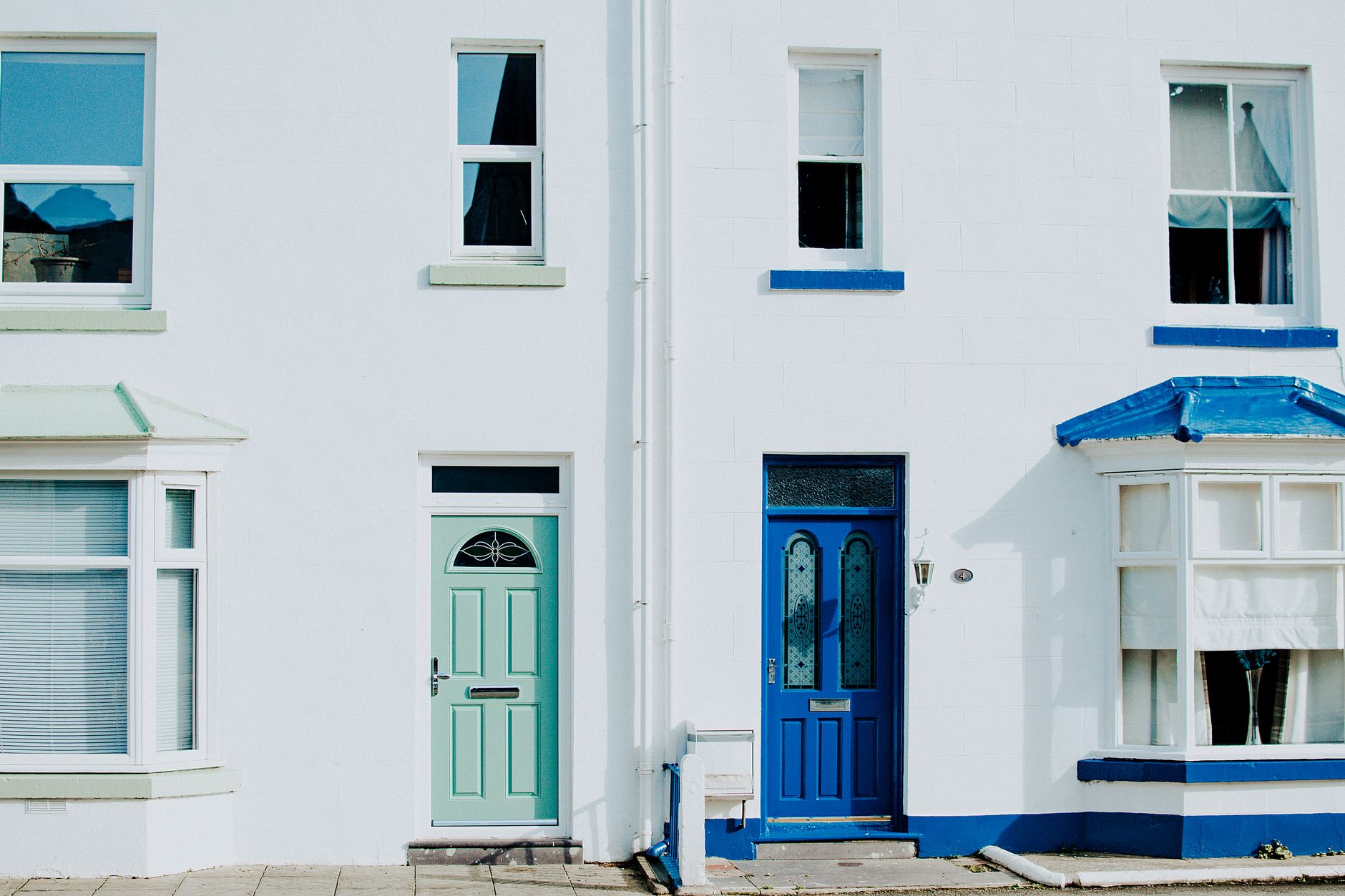
The paint chip called the color something like “harbor mist,” which tells you nothing and was clearly invented by a marketing team rather than anyone trying to describe an actual color. It is somewhere between a dusty blue and a soft green, the kind of in-between shade that shifts depending on what is next to it and what the sky is doing that day. I painted my front door with it about a year ago, and I still could not tell you exactly what to call it if you asked me on the street. What I can tell you is how differently I feel walking up to my own house now, which is the part that actually surprised me.
The old door versus this one
The door was previously a flat, builder-grade black, the same color as probably half the front doors on my street. I did not hate it. I just never thought about it. Walking up to the house felt like walking up to a house, nothing more specific than that. There was no moment of arrival, if that makes sense. The black door blended into the general blur of getting home, unlocking, walking in, the same sequence every day that I mostly do on autopilot.
With the new color, something shifted in that sequence, and it took me a while to notice what exactly it was. It is not that I feel some burst of joy every time I walk up. It is smaller and stranger than that. There is a beat, half a second, where I actually see the door before I open it. I notice the color against the brick, I notice how it looks different depending on whether it is overcast or bright out, and that noticing seems to function like a tiny marker between “out in the world” and “home.” The black door never gave me that marker. It was just there, doing its job, unnoticed.
I do not think the specific color is doing anything special on its own. I think what changed is that I now have a color on my house that I cannot immediately categorize, and that uncertainty is what keeps making me look at it.
The color changes enough to keep my attention
This is the part that took me longest to figure out. A lot of front doors in my neighborhood are colors that read instantly and consistently: navy, black, a certain shade of red that seems to be everywhere. You see them once and you know exactly what they are and you stop registering them after that. My door does not do that. Under overcast light it leans green, almost like a muted sage. In direct afternoon sun it goes noticeably more blue. At dusk, under the porch light, it goes almost gray. It is the same paint the entire time, obviously, but the way it reads keeps shifting depending on conditions I am not controlling.
I did not choose the color for this reason. I chose it because I liked the chip in the store and it seemed like it would go well with the brick. But this shifting quality turned out to be the actual source of whatever effect I am describing. A door that always reads the same way stops being something you see and starts being something you just walk past. A door that looks slightly different depending on the day keeps asking a small amount of attention from you every single time, whether you want to give it or not.
Comparing it to a neighbor’s door
My neighbor two doors down repainted her door around the same time as me, a very clean, confident coral. It looks great and I complimented her on it honestly. But when I asked her, half out of curiosity from writing this, whether she noticed anything different about coming home, she said not really, it just looks nice. That tracked with what I suspected. Her coral reads the same in every light. It is a strong, stable, identifiable color, and there is nothing uncertain about it to keep pulling your eye back. Mine, being harder to pin down, seems to be doing something different, at least for me, even though hers is objectively the more successful design choice by most measures.
I want to be careful not to turn this into a rule, because I do not think it is one. I think it is possible that a confidently single, stable color works exactly the same way for someone else, if that color happens to be rare or surprising in their own context. My neighborhood has a lot of very definite, confident door colors. An in-between, shifting, hard-to-name color might just be the unusual one on my particular street, the same way a stable, bold color would be unusual on a street full of muted, shifting ones.
What I would actually tell someone about this
- Look at what colors are already common on your street or in your building before assuming a specific color will stand out. Standing out seems to matter more than the specific hue.
- Pay attention to how a paint sample looks at different times of day before committing, not because you need it to look the same every time, but because you might actually want it not to.
- Do not expect a big emotional payoff. What I am describing is a half-second of noticing, repeated daily, not some transformation in how I feel about my house or myself.
A year later I still cannot give you a clean name for the color of my front door. Every time someone asks I end up describing it by comparison instead, sort of blue, sort of green, depends on the day. I used to think that vagueness was a flaw in my paint-choosing process, like I should have picked something more decisive. Now I think the vagueness is the actual reason I still notice the door at all, which was never something I managed with the plain black one, decisive as it was.